Expanding the use of the wireframe to print design
Creative teams and clients share a common challenge when kicking off a print project. Content and visuals are often in a loose state, waiting to be formed into diamonds by the pressure of a looming deadline. The initial phase before the first draft inherently has more questions than answers–it’s more aspirational than concrete. There are big picture ideas, broad strokes, and high-level strategic thoughts. “Knowns” yet many “unknowns”. And gaps not yet filled.
With all of that in mind, how do we give the creative team the tools to make the best start, and clients the confidence that the agency “gets it” right off the bat? After all, project timelines don’t allow for teams to wait a couple of weeks for full copy, and even more time after that for layout design. So what is an agency to do?
Try creating a look and feel
At BNO we use an approach that fuels great creative and truly energizes clients. It goes like this. After aligning on the creative brief and a high-level content outline–we begin project development with a unique “look and feel wireframe.”
Wireframing, long the mainstay of website and app design, can make a positive contribution to print projects, too. In this case, the wireframe shouldn’t be confused with the emotionless blueprint associated with digital projects. Think of it Instead as a representation of an evolving concept – demonstrated through actively styled wireframe elements, that absorb and reflect the client’s branding.
Then bring some brand harmony
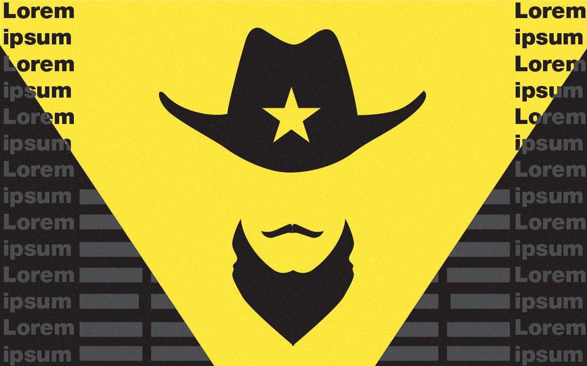
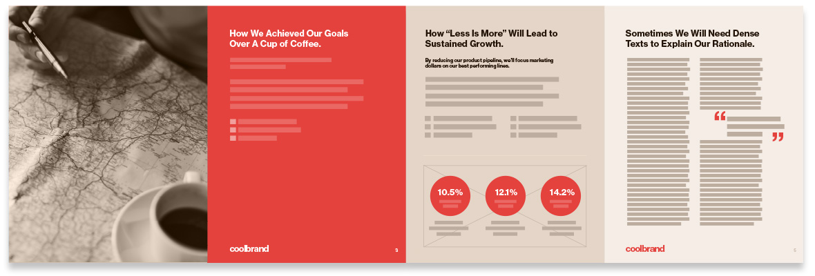
We’ve embarked on several multi-page communication pieces in this unique way and we’ve kicked lorem ipsum to the curb in the process. The result is brand harmony. Combining draft headline and subhead copy–we employ wireframe elements to indicate paragraph texts and bulleted copy. And we develop creative custom placeholders for infographics and icons. This approach allowed us to produce a high-energy draft, utilizing minimal specifics – adding photography in some cases, for an even fuller visual experience.
The loss of lorem is our gain. “Greeking” in type has its place, but there is also a “lorem effect” that dampens the energy of a communications piece. Lorem is synonymous with “unfinished, unformed, and waiting.” It can distract from the overall creative direction and even strategic direction. So why put that kind of energy into your layout? Using the look and feel wireframe approach allows teams to focus and align on a vision for the document before any substantial copy is even written. See example of a “look and feel wireframe” below.

Innovation Report
The project tracks on target, creatively and strategically, throughout the entire process. The methodology increases communication between agency and client. Clients are energized by the process and eager to help shape the collateral. This method is efficient and reduces the overall number of rounds.


